Posts : 315 Join date : 2008-01-09 Age : 30 Location : Canada, On
Subject: No Name Tue Jan 15, 2008 11:07 pm
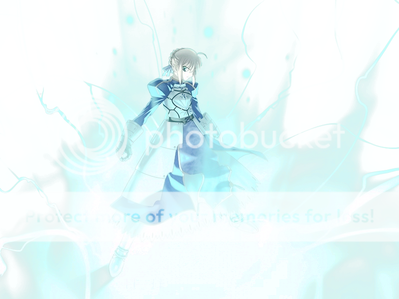
this render was EXTREMELY BRIGHT! and i lowered it alot this one is the bright 1
this 1 is lowered
which 1 is better? this is prob not my best
SpdrMonkey23 Thread Starter
Posts : 82 Join date : 2008-01-09 Age : 31 Location : Arkansas
Subject: Re: No Name Tue Jan 15, 2008 11:09 pm
I would agree its not your best..but not too bad. the top is the best IMO, and your a beast at puttin these sigs out man. lol. try adding a c4d.
MoonBlade PPGFX Fanatic
Posts : 315 Join date : 2008-01-09 Age : 30 Location : Canada, On
Subject: Re: No Name Tue Jan 15, 2008 11:10 pm
erm i guess i lowered my c4d to much huh
MoonBlade PPGFX Fanatic
Posts : 315 Join date : 2008-01-09 Age : 30 Location : Canada, On
Subject: Re: No Name Tue Jan 15, 2008 11:14 pm
c4d is more visable
MoonBlade PPGFX Fanatic
Posts : 315 Join date : 2008-01-09 Age : 30 Location : Canada, On
Subject: Re: No Name Wed Jan 16, 2008 12:28 am
added a border
Digital Admin
Posts : 297 Join date : 2008-01-09 Age : 36 Location : Miami, FL
Subject: Re: No Name Fri Jan 18, 2008 8:01 pm
it's way too bright and there is no real vision of depth everything is very hard to see... i want to see an improvement here
theArtist Co-Owner
Posts : 122 Join date : 2008-01-09
Subject: Re: No Name Fri Jan 18, 2008 10:25 pm
well.. needs more color, it seems almost only blue (lmao, i need to work on that too) mono tone doesnt normally add depth, if any at all.. but keep at it!
MoonBlade PPGFX Fanatic
Posts : 315 Join date : 2008-01-09 Age : 30 Location : Canada, On
Subject: Re: No Name Fri Jan 18, 2008 11:24 pm
render was kinda bright because of the glow around it this is what it is stock lolz and the background is white in ps... well it is kinda obvious